Case StudyCasper
A mattress brand with a fresh start and a 75% increase in revenue year on year
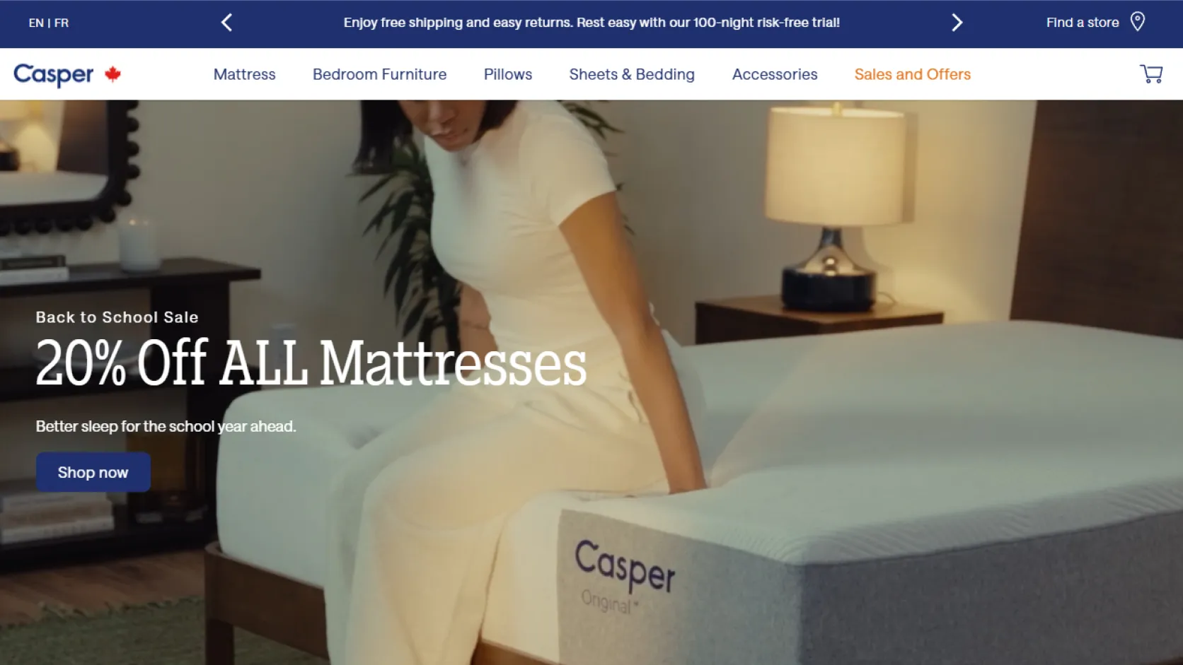
Casper split its Canadian and U.S. operations into two separate entities, which meant the Canadian website needed a redesign to better serve its local audience. I redesigned the mattresses page to function as a high-converting landing page and created a dedicated sales page optimized for seasonal campaigns and promotional offers.
Overview
A mattress landing page designed for conversion and campaign performance.
The mattress category page needed to do more than showcase products. It had to work as a landing page that introduced the brand, educated shoppers, and led them toward a purchase decision with clarity and confidence.
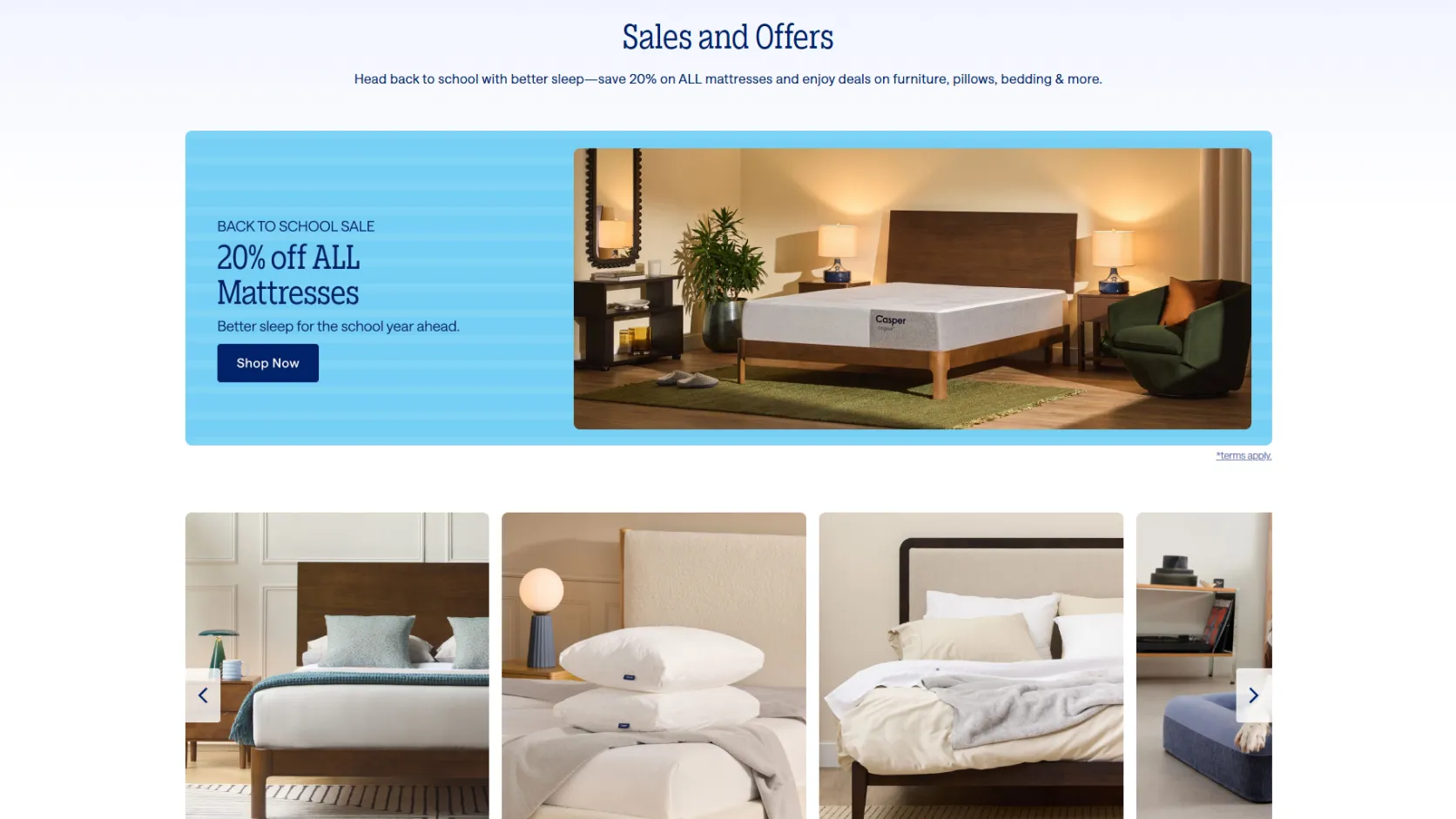
I redesigned the page to serve as a high-converting product hub and built a dedicated sales page optimized for promos, seasonal offers, and targeted campaigns that drove urgency and action.
What I Did
I redesigned the mattresses page to function as a true landing page, giving the product category a clearer narrative around comfort, support, and value. The page needed to help Canadian shoppers understand the product quickly and move confidently toward purchase.
I also created a dedicated sales page built specifically for promotional campaigns, with stronger urgency messaging, cleaner offer hierarchy, and a more conversion-focused layout for discounts, bundles, and seasonal deals.
The work focused on simplifying the journey, increasing trust, and making the offer feel compelling without overwhelming the user. The result was a cleaner path from curiosity to conversion.
Design Decisions
The key decision was to make the mattresses page feel more like a premium conversion landing page than a generic product listing. The layout prioritized clear product storytelling, trust signals, and purchase-focused CTA placement.
I also designed the sales page to be highly campaign-ready, using strong promo headers, benefit-driven sections, and a frictionless path to checkout or lead capture for time-sensitive offers.
The visual direction kept the brand approachable and modern while elevating perceived value. Clean hierarchy, high-contrast product imagery, and clear benefit messaging all helped the experience feel more premium and persuasive.
Outcome
- Reframed the mattress page as a clear conversion-focused landing experience for Canadian shoppers
- Created a dedicated sales page optimized for promotional campaigns and time-sensitive offers
- Improved product storytelling to better communicate comfort, support, and value
- Streamlined the user journey from discovery to purchase intent with cleaner hierarchy and trust-building elements
- Built a more premium, conversion-ready experience aligned with a modern mattress brand
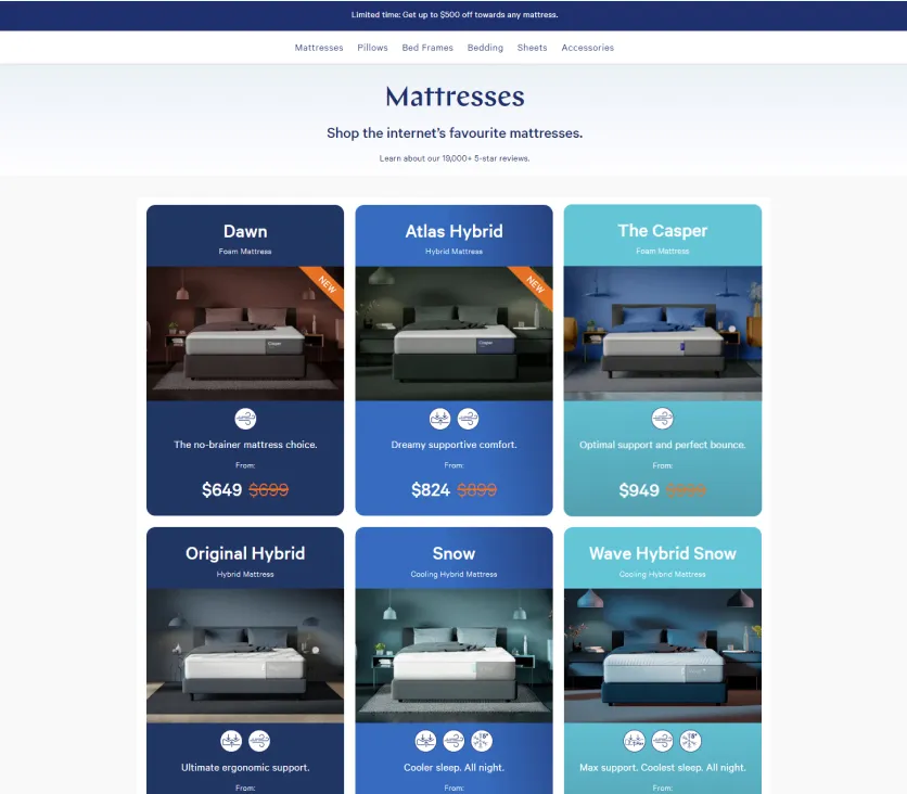
Old product page
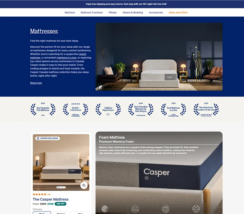
New product page
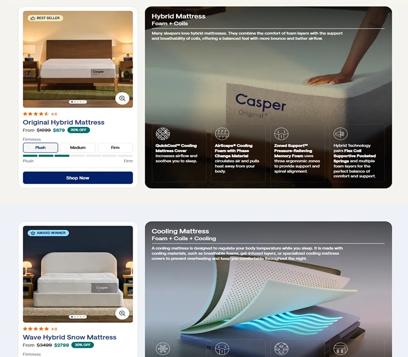
Listed mattresses on product page
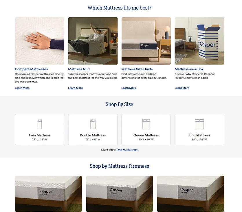
Additional shopping options on product page
Future Steps
- Expand the product page into a more complete category experience with better navigation, filtering, and size selection.
- Build out a modular mattress comparison flow so shoppers can evaluate comfort, support, and price more easily.
- Create more campaign-specific sales templates for seasonal promos, bundles, and limited-time offers.
- Add personalized recommendations and quiz-driven product discovery to guide customers toward the right mattress.
- Continue optimizing the page with conversion tracking and testing to improve performance over time.